 Elizabeth Shriver Ceramics

"Why don't you add some color to your work?" That's a question I am asked now and then, and while I don't mind explaining, it's hard to put into words, as it is a matter of subjective preference, not one with a clear answer that's right for everyone. For the functional potter, in to have a non-porous, durable surface suitable for everyday use, glaze is a must. But for ceramic sculpture, glaze is optional. I'm not personally opposed to glazed sculpture, in fact some of the pieces I most admire are beautifully glazed, colorful works of art.
Yet there is also a rich tradition of "naked" or unglazed ceramics, in which the surface of a piece is enhanced by texture, stains, burnishing or pit-firing. Artist Jane Perryman has written a
book about the history of naked clay, and her book would be a great place to start if you're interested in learning more about the subject.
Here's a link:
http://www.bloomsbury.com/uk/naked-clay-9781408111055
As for my own work, I feel that adding glaze would detract from the form and texture of my organic ceramics. The more complicated the shape and the more texture I add, the less I feel additional color is needed. There is some variation in color due to the different clays and stains I use, but if I add glaze, it's most likely on the inside of a vessel, not where it is likely to stand out.
Many other artists who create organic forms shy away from glazes, probably for reasons similar to my own. In my mind, the best organic pieces are a simple off-white, or near black, with very little, if any added color.
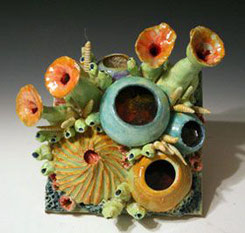
As a contrast to my own work, I'm sharing this piece by Diane Martin Lublinski as an example of a bold use of color on an organic sculpture. To me, a more subtle use of color would be preferable, as these bright colors compete with the shapes for attention. The result is a cluttered piece.

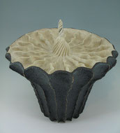
This pod sculpture by Alice Ballard uses color more effectively. The orange center contrasts sharply with the neutral colors of the form, and the result is a striking focal point.
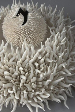
Here is a lovely organic piece by Lorna Fraser, all in white and perfect as is. Adding color would be an unnecessary distraction.

On the other hand, this piece by the same artist is equally pleasing, though she has added color to highlight the spikes.
Would the sculpture be as effective without the contrasting color? It's hard to say.
Once again, when it comes to color, we all have our preferences, but there is no right or wrong. For me, I generally accept the rule that less is more.
|
|


Write a comment